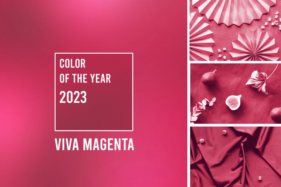
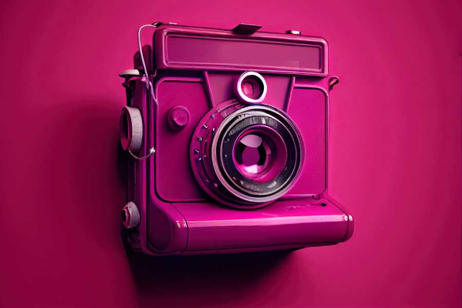
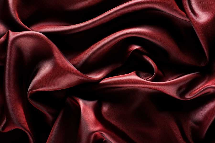
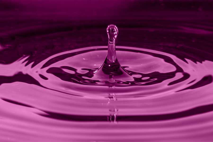
Once again we bid farewell to the year by discovering the color of 2023: Viva Magenta 18-1750.
Pantone defines this color as a vibrant color, with vigor and energy. An empowering, joyful and optimistic color.
Full of power and energy, this color promises to be a source of inspiration and a driver of design in all its manifestations.
A year 2023 full of positivity. A year more inclusive than ever.
Viva Magenta 18-1750
At the same time, Pantone reflects with this proposal the combination of natural colors from the movements around climate change, sustainability and earth protection.
If climate change already became a major issue in 2022, in 2023 it promises to become the main protagonist of the year.
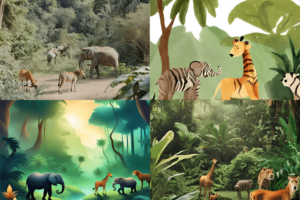
All this has also been reflected in the Stock Media sector, where hundreds of microstockers have been able to get hooked on this trend.
The representation of nature in countless lifestyles:
- Homes filled with plants, living walls and restorative outdoor spaces.
- Enjoying travel again, discovering corners of the world.
- Doing sports and outdoor activities with friends.
Thus, Viva Magenta 18-1750 represents the richness, warmth and strength of natural materials.
In addition, the metaverse creates new opportunities that inspire the confidence and courage of this color, while winking at this new universe.
365 days in which connections between people will predominate, Viva Magenta 18-1750 embodies the acceleration of globalization and the hyperconnection of all humanity.
Security, motivation and strength after 3 years of pandemic.
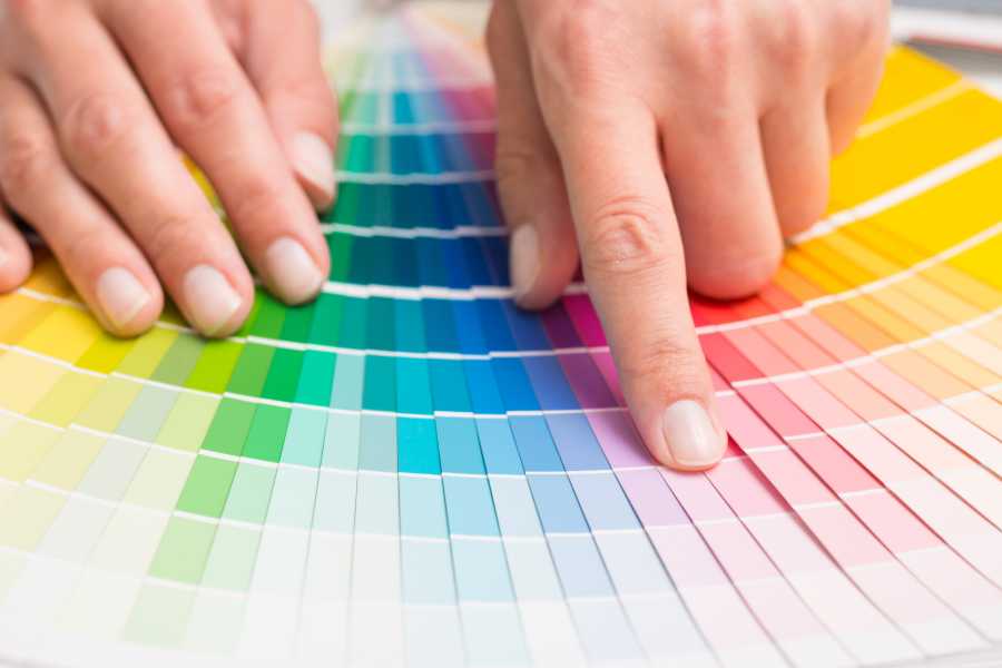
What is Pantone?
Pantone was born in the mid-1950s in New York City, a historical moment characterized by a multiracial population and an emerging city.
In this sociocultural context, Pantone patented a system known as the Pantone Matching System, which reduced the number of pigments needed to create any shade of color from 60 to 10, with a precision that was unique at the time. This not only revolutionized the world of design, but it also meant a new form of communication.
Before the arrival of Pantone and its system of color guides, companies faced many complications when printing the packaging of their products because there was no standardization of colors in the printing presses.
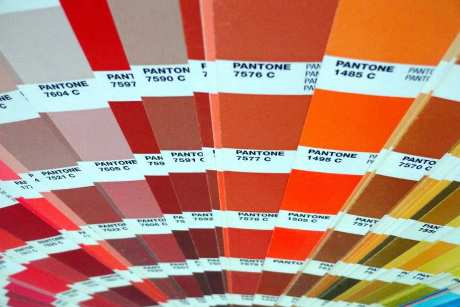
Today, Pantone has more than 2,000 references that are updated periodically to keep up with the trends and needs of society and companies.
Thus, the company has established itself as a design authority and a reference for many designers and artists.
With more than 17 offices around the world, Pantone has revolutionized the industry beyond color catalogs, currently has a wide variety of merchandising products and even hotels.
In addition, more and more companies are seeking to associate themselves with the brand as a sign of reputation. This has been the case for brands as diverse as fashion accessories or bicycles.
If it has color, it has a Pantone.
Pantone’s relationship with the color of the year
In the last decade, Pantone has become a reference for the world of fashion, art and culture around the world.
Such is its influence, that the big brands in the industry wait for its announcement of the color of the year to carry out their own designs or marketing strategies.
A moment that even the most influential microstockers do not let pass by, influencing their own content calendar and seeking to adapt part of their portfolios to the trends of the moment.
In addition, more and more brands want to join this annual milestone and seek to make all kinds of collaborations. This has been the case this year with Motorola and Cariuma, who have not wanted to miss the opportunity to join the most anticipated event in the world of design and art.
How is the color of the year chosen?
Those in charge of choosing the color of the year are part of Pantone’s team of trend hunters. A group of experts whose work is focused on studying the Pantone Color Institute and analyzing the fashion and design of the last months of the year in order to predict the most influential color of the coming year. The team is led by Leatrice Eiseman, executive director of the Pantone Color Institute; Laurie Pressman, vice president of the Pantone Color Institute and David Shah, color consultant.
More than 9 months of research and study is needed to determine the color of the year. This shows that it is not a random choice but involves a whole process of analysis and debate within the Pantone team.
Pantone defines this process as a “snapshot” of global social and cultural events. A color that expresses the mood and state of the population at any given time.
For more than 20 years now, a whole event and expectation has been organized around the world to know the announcement of Pantone’s color of the year.
The colors of the last 10 years
2022: 17-3938 Very Peri
A color that stimulates ingenuity and personal creativity. A carefree confidence and daring curiosity. Pantone seeks with this color to rekindle gratitude for some of the qualities that blue represents complemented with a new perspective.

2021: 7-5104 Ultimate Gray & 13-0647 Illuminating
A union of colors that conveys the message of strength and hope in a year that was marked by the end of an unexpected pandemic that swept the world.
2020: 19-4052 Classic Blue
A haven of calm, confidence and connection, Pantone sought with this color to represent concentration and provide the necessary clarity in an interconnected world.
2019: 6-1546 Living Coral
Lively and vita, Living coral is a color that bets on life, with flashes of energy and reflection of dynamism. Warm and optimistic, Pantone shared with this color the constant transformations of this era.

2018: 18-3838 Ultra Violet
A thoughtful and bold color that communicates originality, ingenuity and a visionary mindset of a new era. The intrigue of the future and the novelties that will accompany it.

2017: 15-0343 Greenery
A shade that combines green with refreshing and revitalizing yellow reflecting new beginnings. Pantone evokes the exuberance of nature with this color.

2016: 13-1520 Rose Quartz & 15-3919 Serenity
This was the first year that a two-tone combination was announced as Pantone’s color of the year. A year in which consumers value wellness and full awareness in the face of the stresses of modern life.

2015: 18-1438 Marsala
Pantone’s 2015 color of the year was focused on gastronomy, as a representation of the satiety of food. Appealing to both men and women, Marsala is an easy shade to translate to fashion.
2014: 18-3224 Radiant Orchid
A color dominated by pinkish hues that conveys the healthy glow of men’s and women’s skin. This color moved to fashion runways around the world. The translation of this color is “Radiant orchid for beauty”, Pantone wanted with this year to share the beauty of a world that is sometimes hostile.
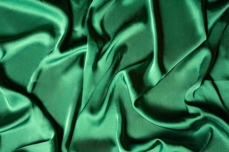
2013: 17-5641 Emerald
Pantone’s color of the year this year conveyed a boost of energy based on lively reddish-orange tones. The deep green of emerald enhances a sense of well-being, inspiring insight and promoting balance and harmony.
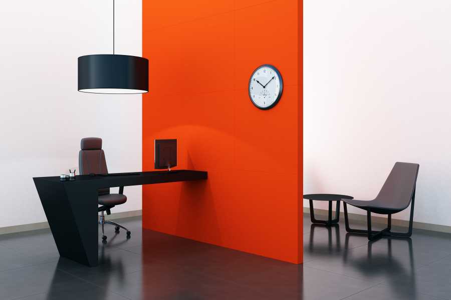
2012: 17-1463 Tangerine Tango
The popularity of the color orange and the acceptance among the most influential designers, is the basis on which Tangerine Tango is born, a provocative and attractive color in men’s and women’s fashion.
More than a color
There is no doubt that Pantone’s color of the year has a global influence in the world of design, advertising, fashion and art. What started as a simple marketing strategy has managed to position itself as one of the most influential and anticipated events of the year.
The greatest proof of this is the creation this year of the Magentaverse, a nod to a new era in the digital world, and the American company did not want to miss the opportunity to join this trend.
A countdown followed by millions of people and that has managed to create a whole universe around the color of the year, as has been the case of Magentaverse of the next 2023.
From Vecpho, we will follow this presentation closely year after year.