Microstockers evolve and we adapt to these new changes. That’s why at Vecpho we want to restructure the foundations of the company based on a new image.
We want microstockers to feel that we represent their ideas and their needs.
Redefining the concept of microstocking
Closer, friendlier and more recognisable. This is just the beginning of the disruption that Vecpho represents in microstocking.
We know that microstockers want to make money selling their photos, vectors or videos online, they want to make a living from their stock photos, from their art, from their content… And Vecpho’s mission is to help them reach those goals. To facilitate the creative tasks and help them in those moments when the muses abandon them.
Monetising photographs, graphic designs or any other type of content will be our sole concern.
Earning more money, getting better deals and receiving personalised advice are the basis for making a living from online photography. We are that helping hand that will accompany you in your development as a microstock professional.
The best way to make a living from microstock sites
With the rebranding we have done at Vecpho, we have managed to redefine many key elements of the brand.
We listened to the microstock authors we represent and realised that we didn’t represent the idea we wanted to convey. Our idea of getting you better deals with microstock sites and helping you make money from your work needed a visual reimagining.
And, after listening to our team and our microstockers, we reimagined the idea of what Vecpho wants to represent based on four key values.
We are the new Vecpho
Vecpho has character and personality. Our goal is to enhance that character so that we are instantly identifiable.
- Proximity
- Professionalism
- Versatility
- Experimentation
We are clear about who we are and what we want to transmit.
As a personality, Vecpho fulfils the characteristics of the archetype: Wise.
We are experts in microstock, we know how it works, how to make money, how to work and live from it. And our goal is to let you know that, helping you, guiding you and being the support that is there when you need it.
Relating to microstockers in an assertive, close, intelligent and human way, is what we have been doing for a long time now and that is what we want to convey.
A logo that represents us better
The logo is the visual representation of who we are and the philosophies that drive us, the values that unite our community and the beliefs that inspire us.
For the new logo we have drawn on the following concepts for the redesign:
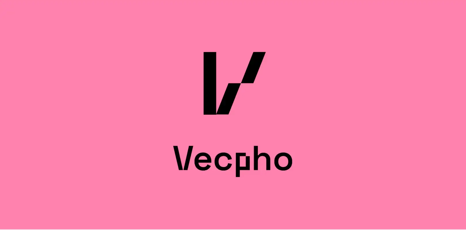
Vector/pixel duality.
At Vecpho we represent all digital files that are sold on microstock sites, whether they are vectors or pixels. We wanted to represent this duality of file types in the new symbol and logo in a subtle way.
Solidity
We wanted the new symbol to convey solidity, to be monolithic and imperturbable. For this we played with quadrilaterals so that it would be easy to reproduce and at the same time convey strength. A solid base built on the basis of a grid helps us to seek a greater simplification of shapes and facilitate its construction.
Cleanliness and minimalism
“Less is more”, we want to extrapolate this philosophy to the new logo and the rest of the brand elements. To do so, we have opted for a chromatic range with few colours but with a lot of strength, looking for the essential elements or omitting the accessory elements to be direct and clear.
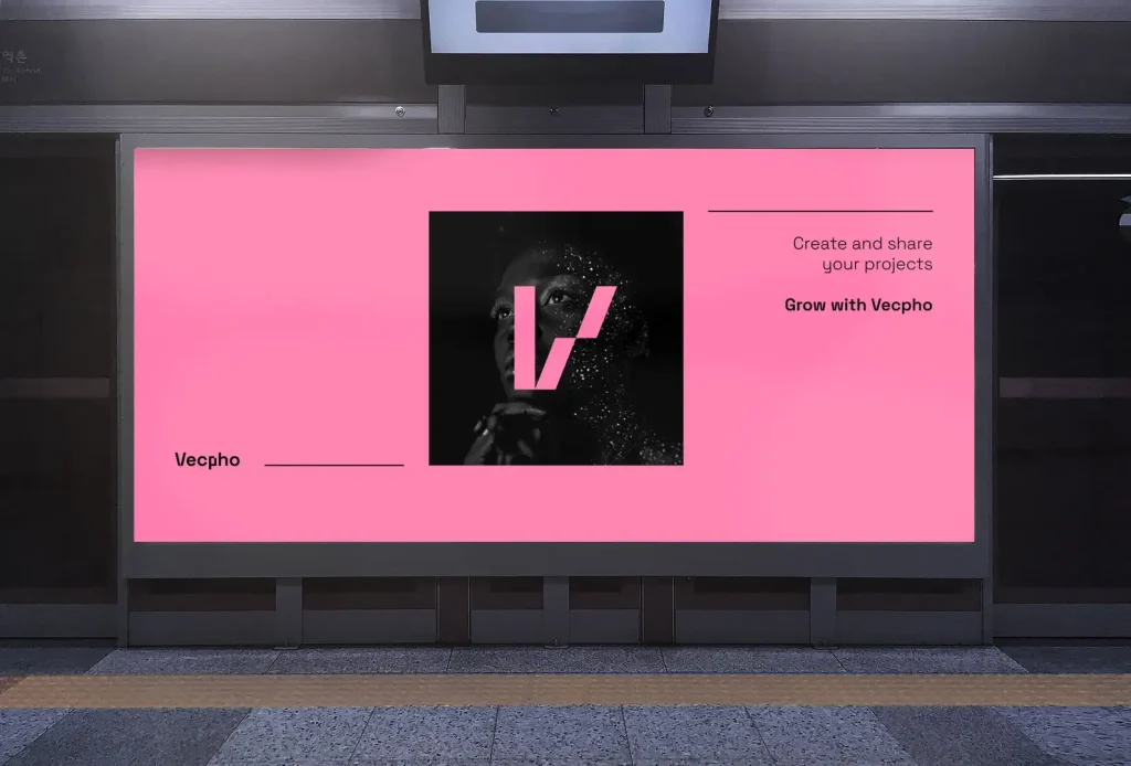
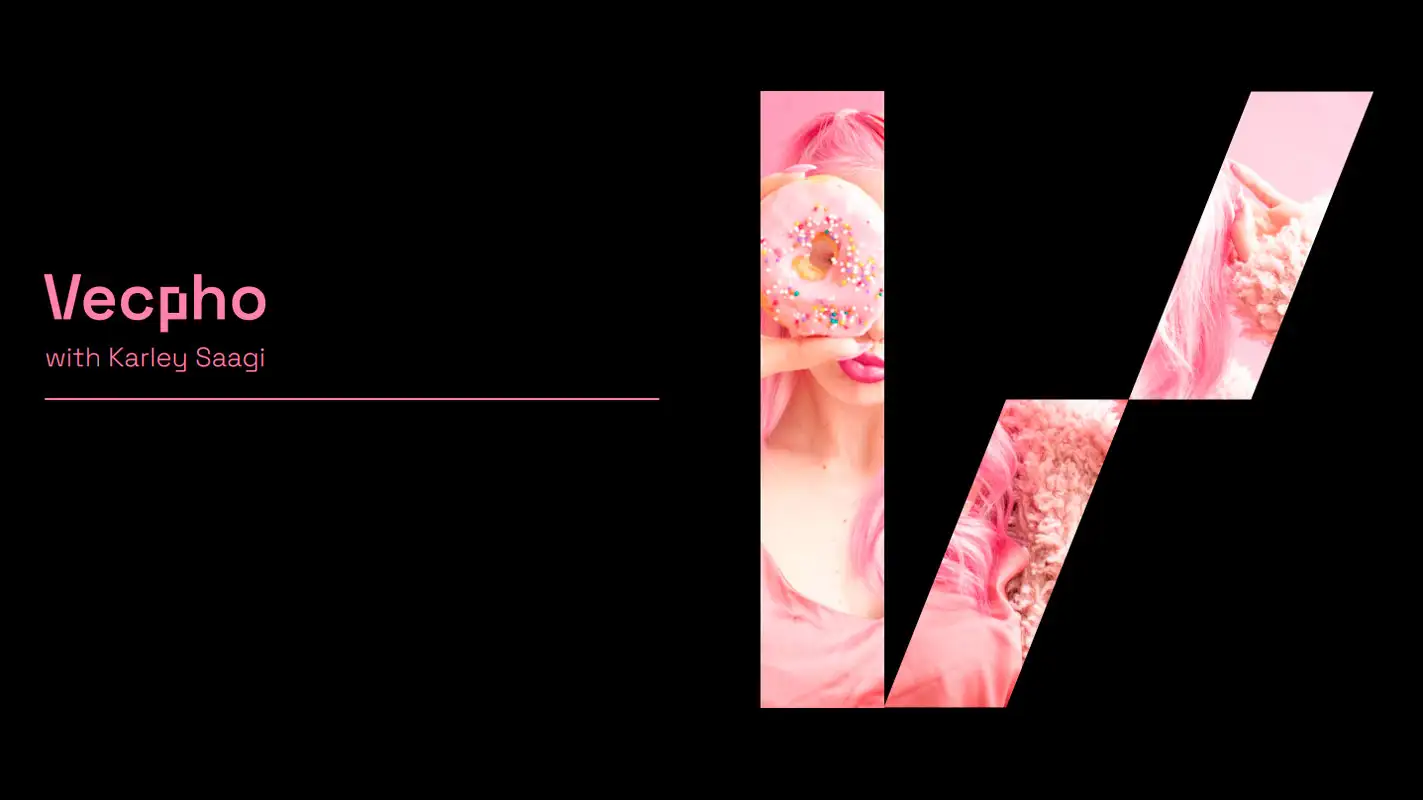
The Vecpho logo is flexible. It serves as a stage where we share the emotional and projects with a story behind.
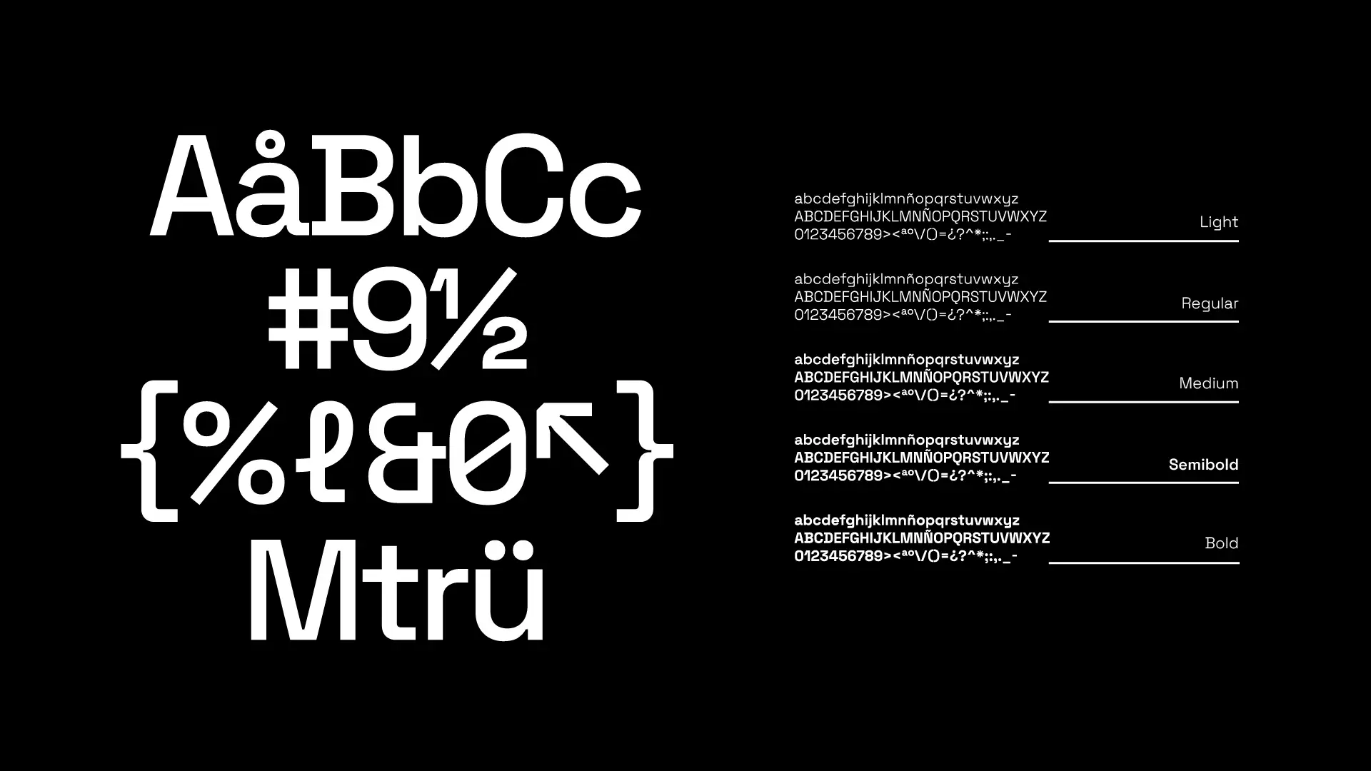
As for other elements of the brand, we start with Vecpho’s typeface, called Space Grotesk. It is a contemporary grotesque sans serif, with a play on geometric shapes and simple forms. Space Grotesk is not afraid to be simple but with personality.
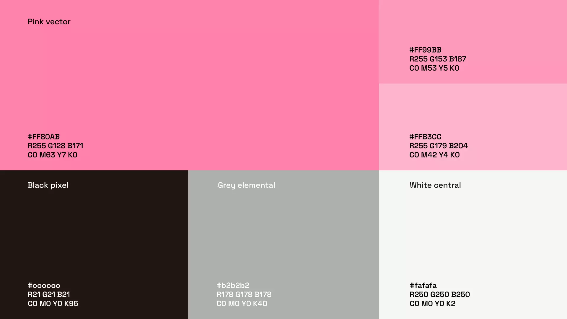
In terms of colour, vector pink is our main colour. The colour seeks to be aligned with the experience you expect to live at Vecpho; vibrant, approachable and different.
This is a sign of who we are at Vecpho and where we want to go.
Creators, welcome to the new Vecpho.

